Today’s chosen theme is “Minimalist Color Schemes for Interior Design.” Step into a world where fewer hues create more calm, clarity, and character. Follow along, share your space, and subscribe for color-smart ideas that feel effortlessly livable.
The Psychology of Quiet Palettes
Calm by Contrast: Why Less Color Feels Like More
When a room reduces competing colors, every remaining tone stands taller. The quiet lets texture and light do the talking, creating a grounded rhythm that supports reading, deep work, and slow, restorative evenings.
Neutrals, Not Boring: Emotional Range of Whites, Greiges, and Sands
Warm whites feel comforting like fresh bread, while cool greiges sharpen focus like crisp morning air. Minimalist palettes aren’t empty; they are tuned instruments, carefully orchestrated to support your daily rituals and relationships.
Your Turn: Tell Us When Color Quiet Changed Your Day
Have you repainted a room and suddenly slept better or worked longer without fatigue? Share your story in the comments and inspire others to try a calmer, more intentional palette at home.
Undertones Matter: Warm vs. Cool Whites in Real Homes
Test samples on poster boards, move them around across the day, and compare against flooring. You’ll see creamy warmth or blue-gray coolness appear clearly under morning light, evening shadows, and artificial illumination.
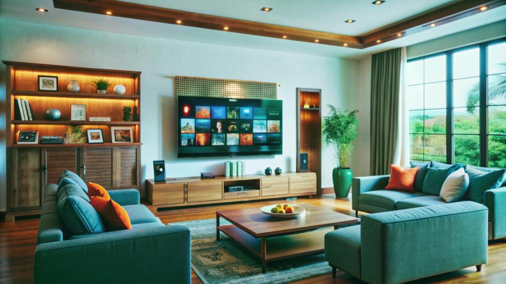
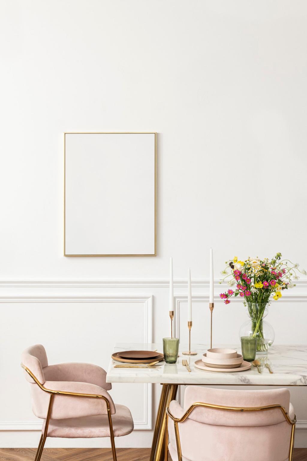
Two Neutrals + One Accent: A Reliable Minimalist Formula
Pick a main neutral for walls, a secondary neutral for trim or large furniture, and one disciplined accent for depth. This constrained trio keeps decisions simple while still delivering comforting variation and focal interest.
Get Involved: Subscribe for Printable Swatch Worksheets
We’re sharing an easy worksheet to log undertones, sheen, and light conditions. Subscribe to download, then post your trio in the comments so others can learn from your discoveries and avoid costly repainting.
South-facing rooms enhance warmth, making a neutral look creamy and inviting, while north exposure cools it toward gray. Paint feels alive as the sun moves, so evaluate swatches at several times of day.
Choose one color temperature—2700K for warmth or 3000K for balanced clarity—and repeat it across fixtures. Mixed bulbs can distort undertones and break the serenity that minimalist color schemes work hard to establish.
Is your living room bathed in gold or softly shadowed? Share a quick photo and describe your light direction. We’ll suggest subtle shifts—warmer or cooler neutrals—to keep your palette authentic and restful.
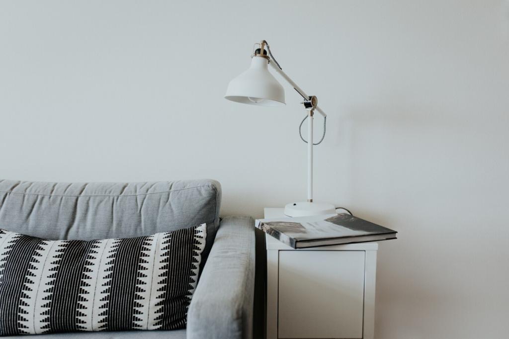
Texture as the Fourth Color
Matte walls swallow light and calm reflections, eggshell adds quiet durability, and satin highlights details like millwork. Sheen choices can behave like subtle color shifts, sculpting dimension while protecting the overall minimalist mood.
Texture as the Fourth Color
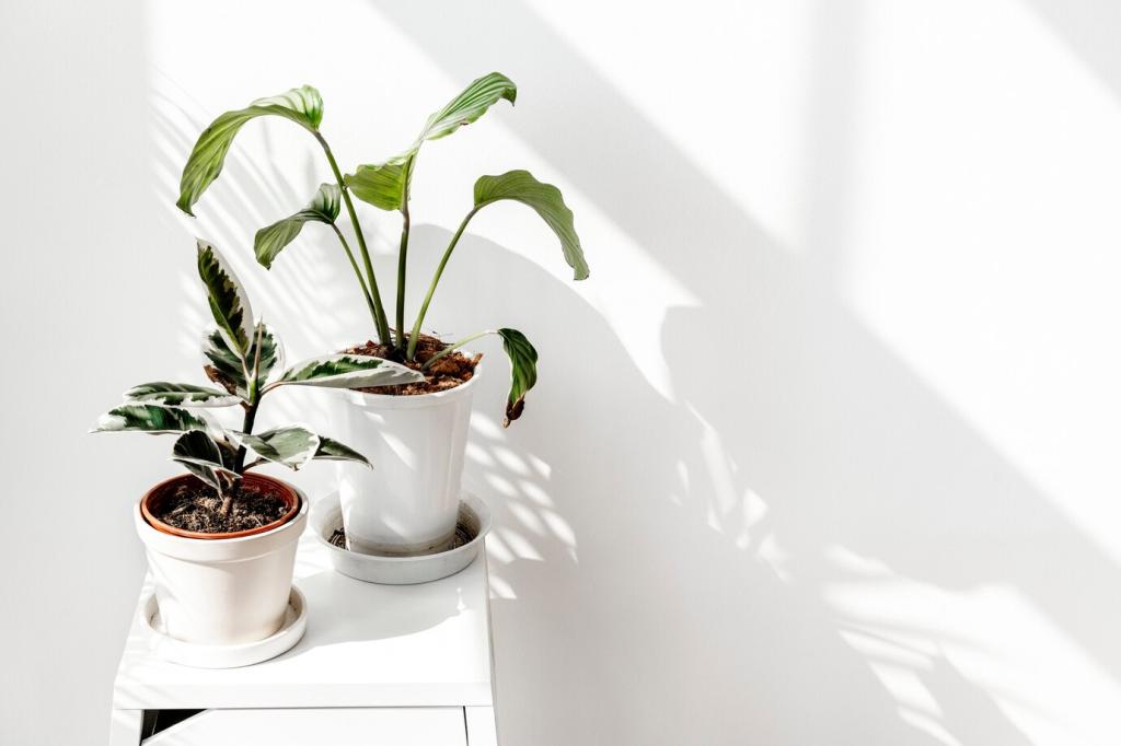
Pale oak introduces gentle warmth, linen diffuses light beautifully, and limewash brings movement without extra colors. These tactile notes read as ‘visual seasoning,’ enhancing comfort while keeping the palette intentionally restrained.
Texture as the Fourth Color
A reader paired a soft sage linen sofa with off-white walls and natural jute. The room felt airier, not busier, because the textured fibers whispered instead of shouting, preserving the minimalist color discipline.
Accents with Intention
Thin black lines in window frames, picture rails, or lamp bases create crisp boundaries that emphasize negative space. A few disciplined strokes add structure without overwhelming the room’s tranquil, minimalist foundation.
Introduce a textured rug, linen curtains, or a pale wood sideboard before adding new pigments. These elements restore comfort, keeping the minimalist color scheme intentional while softening edges that feel too clinical.
Common Pitfalls and How to Fix Them
If cool trim fights warm walls, add a bridge tone—think soft greige—through textiles or a single painted piece. This mediator blends temperatures and restores coherence without repainting the entire space immediately.